DESIGN
STEHLIK
BRAND DESIGN
↓
UI/UX
Design reveals
the soul of a brand



Czech designer that works with brands around the world, creating unique branding, motion design
and user friendly interfaces.
Frank Stehlik
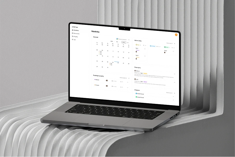
I worked with Frank for several years on graphic and UX/UI design. He designed interfaces for a range of applications delivered to Utima.cz clients and played a key role in the complete redesign of the Kanbu.ai brand and application. He has a strong eye for simple, clean design, quickly understands functional requirements and turns them into intuitive solutions with minimal steps and cognitive load. Whenever something needed to be done quickly, he was always ready to jump in. He was open to feedback and improvements, and over time our collaboration grew into a relationship built on mutual trust, allowing him to work independently without the need to micromanage details. Communication with him was always straightforward, fast and friendly. I highly recommend working with him.
 Jakub KubištaFounder Kanbu.ai & Utima.cz


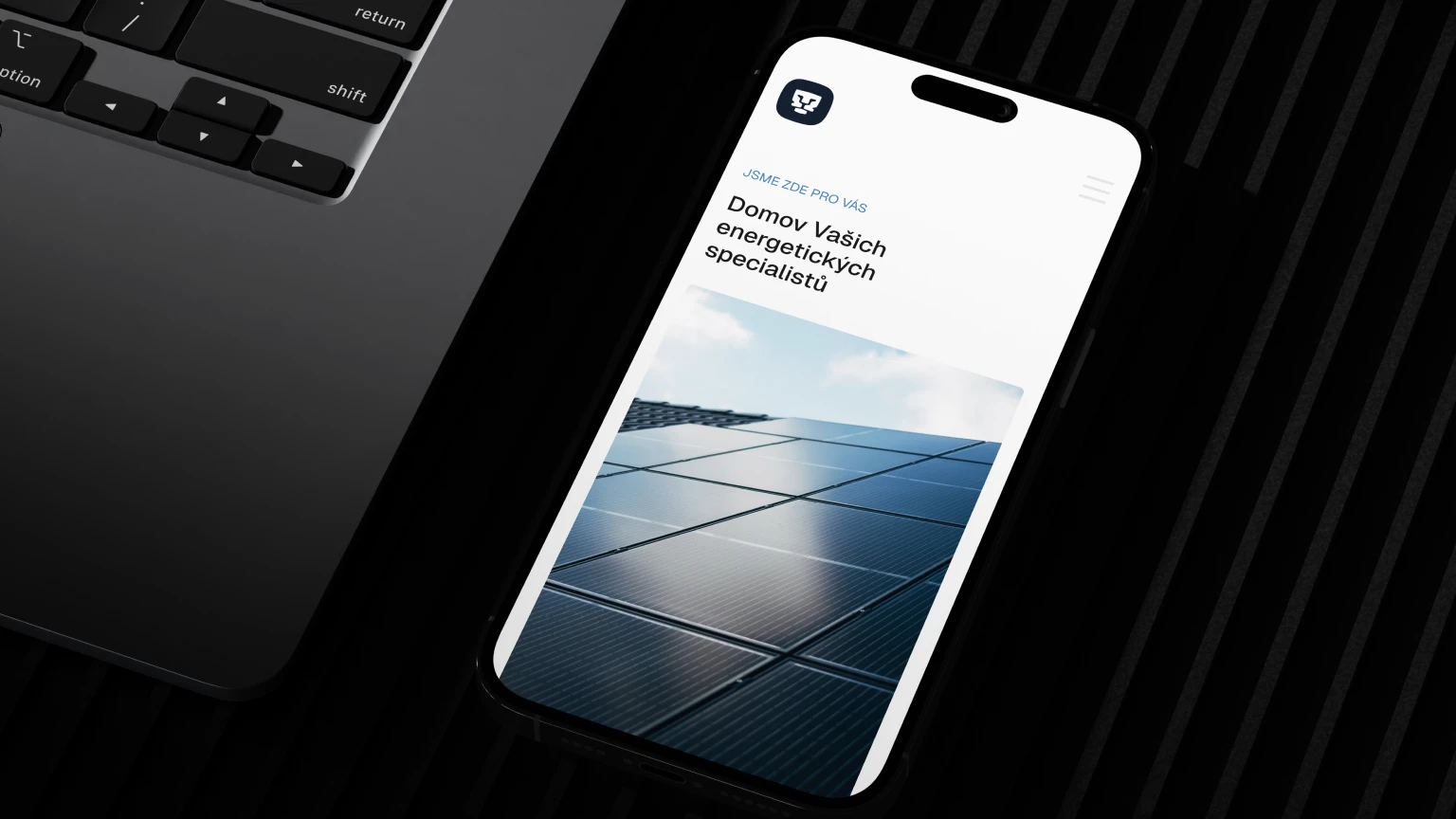
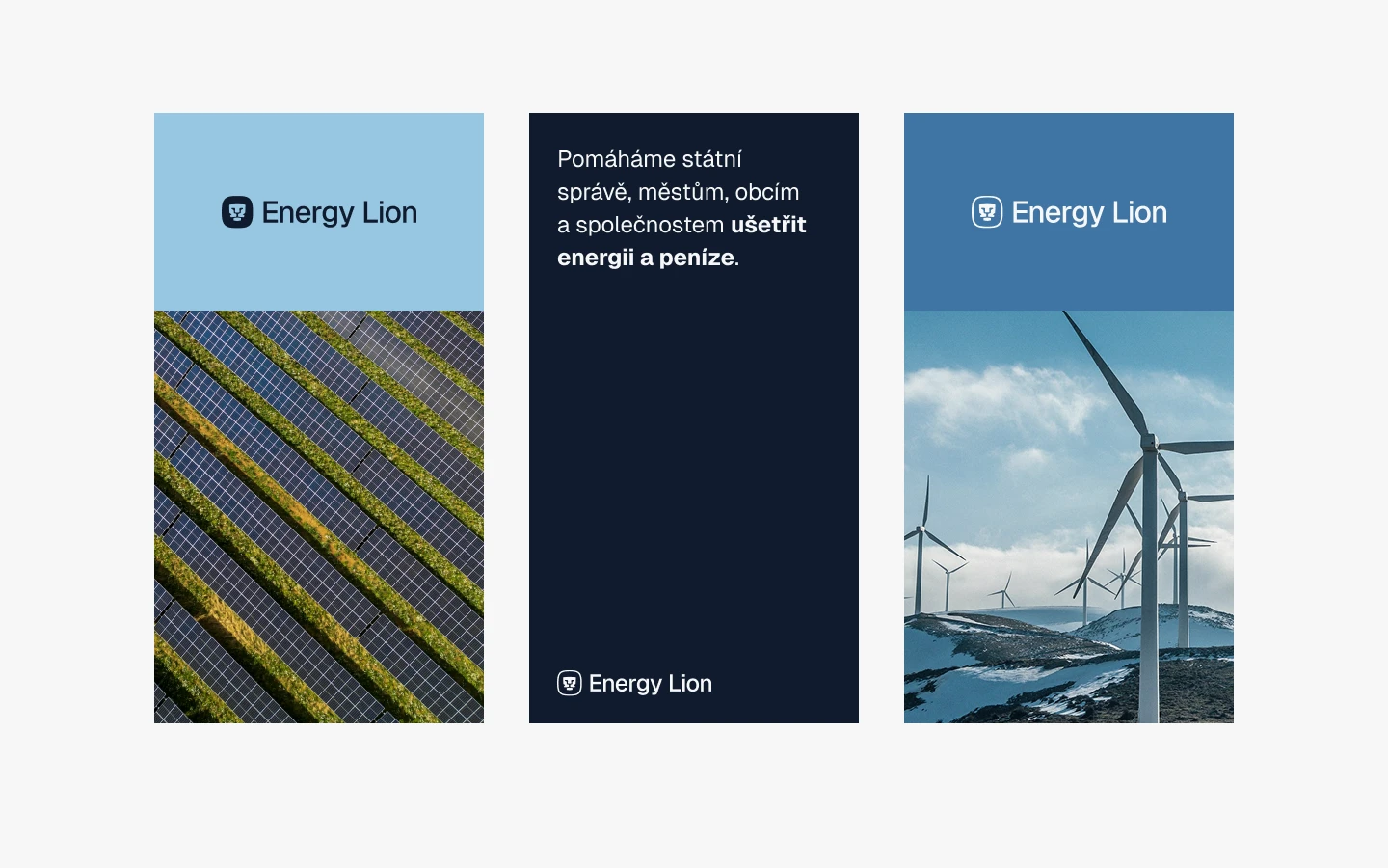
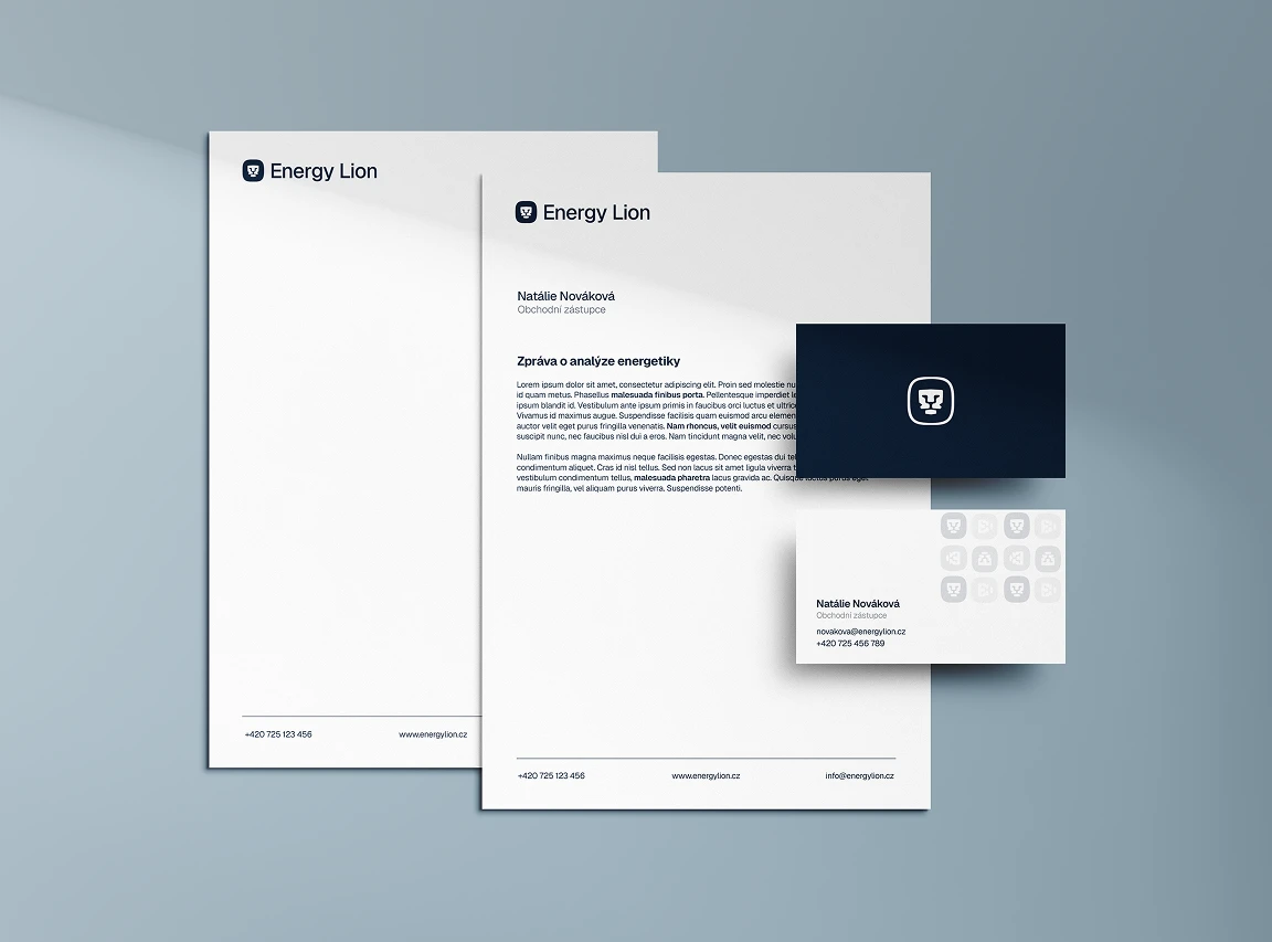
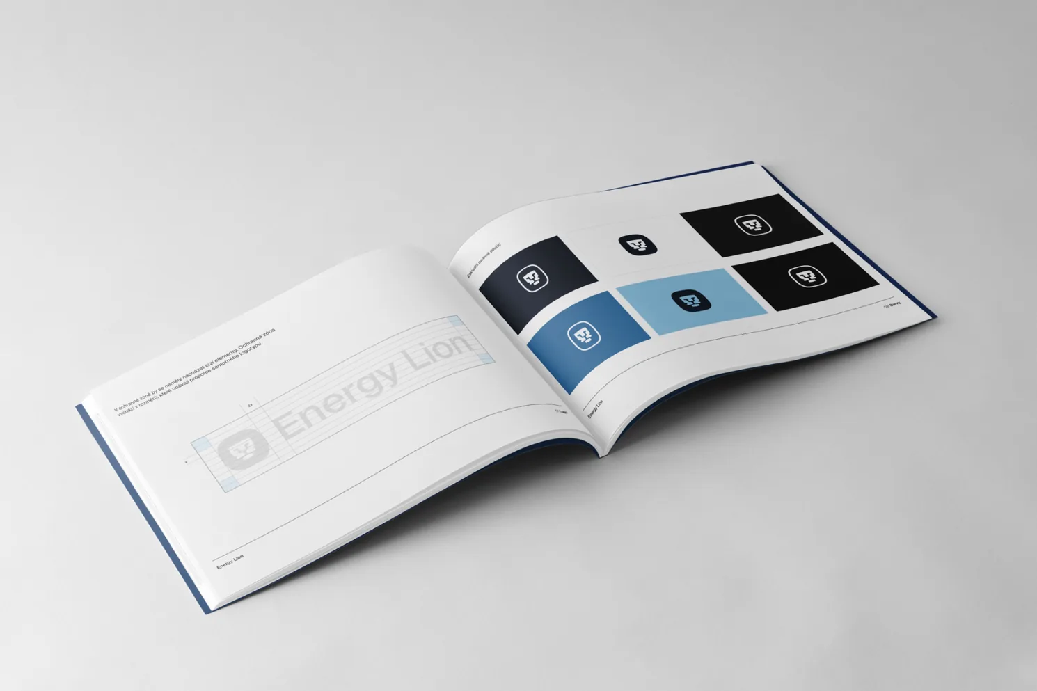
Energy Lion had grown into a company working with cities, public institutions and businesses. Its visual identity had not grown with it. The goal was to transform an amateur-looking brand into a credible and representative B2G identity, without losing the lion that had been part of the company from the beginning.
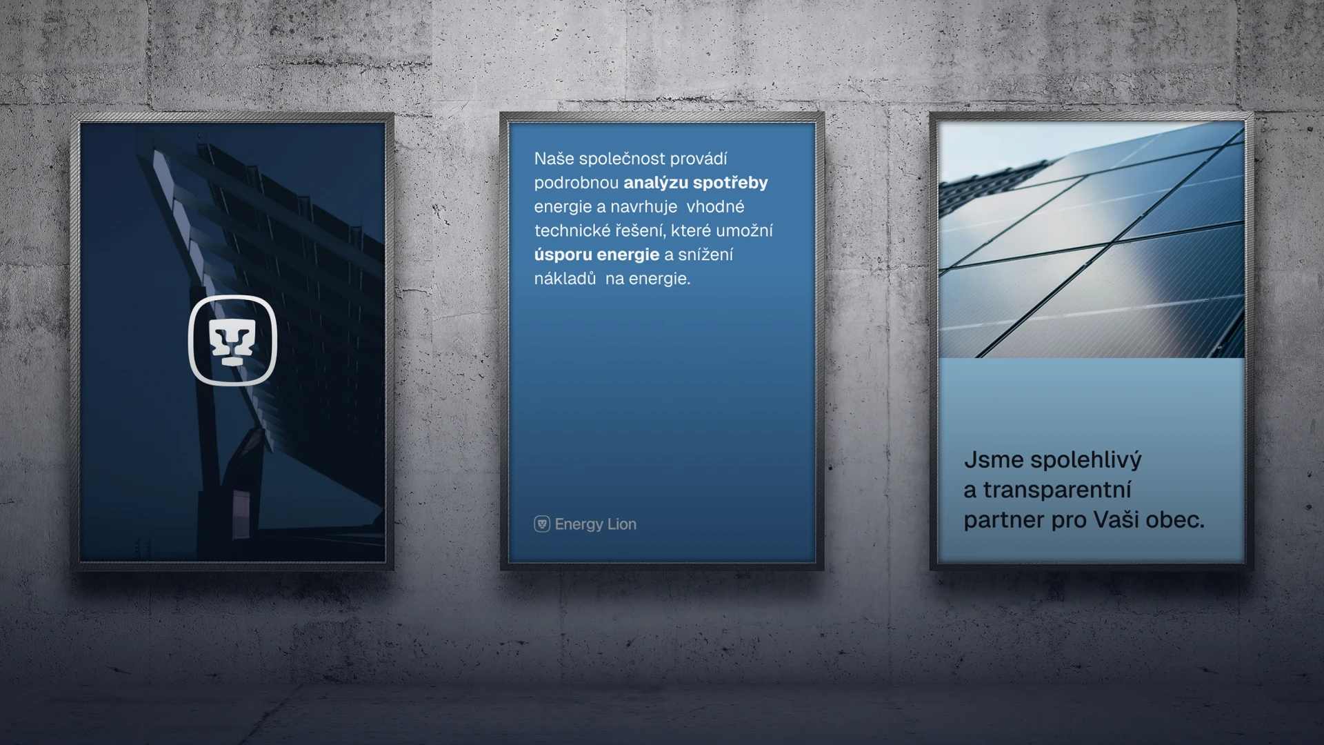
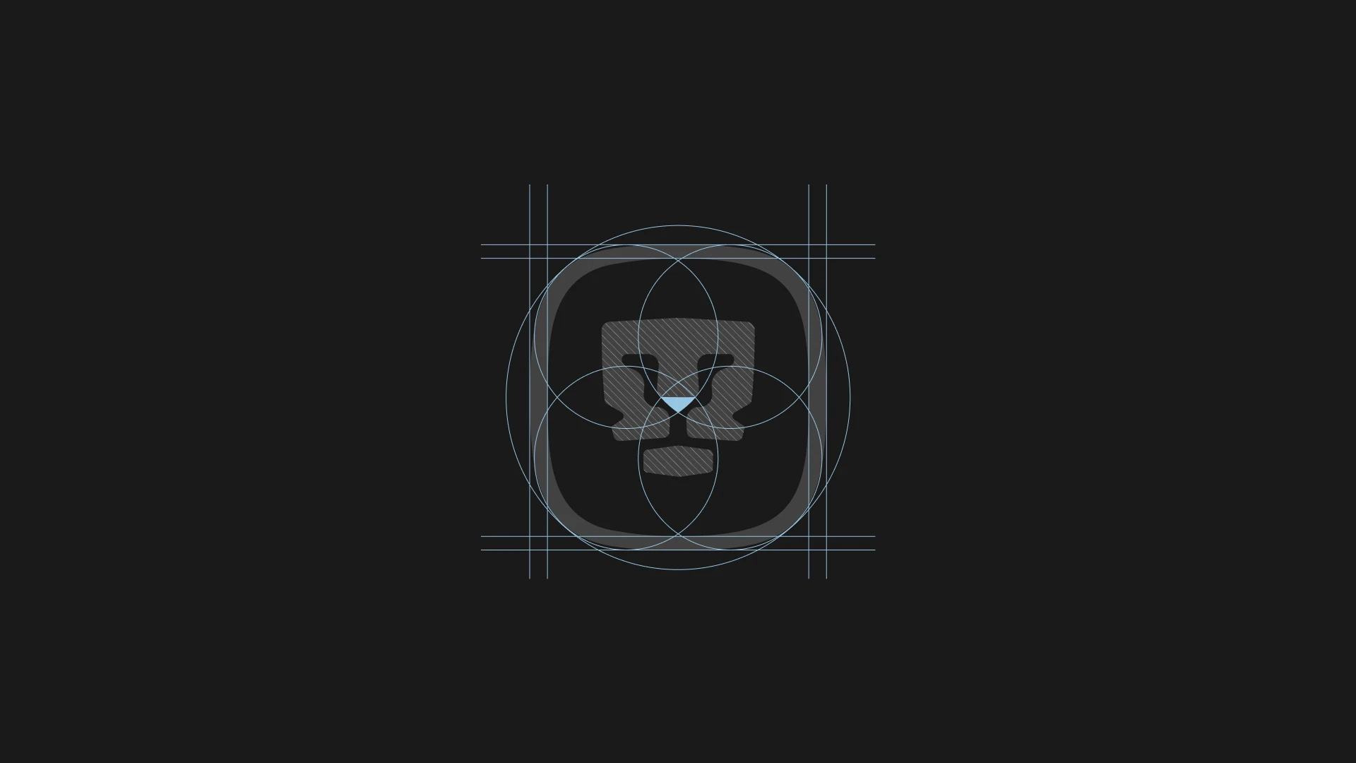
Rather than starting from scratch, the redesign was built on the strongest recognizable element Energy Lion already had. The original lion was reworked into a cleaner, more deliberate symbol and became the foundation for a new visual system designed to feel reliable, contemporary and appropriate for a company operating in the B2G sector.
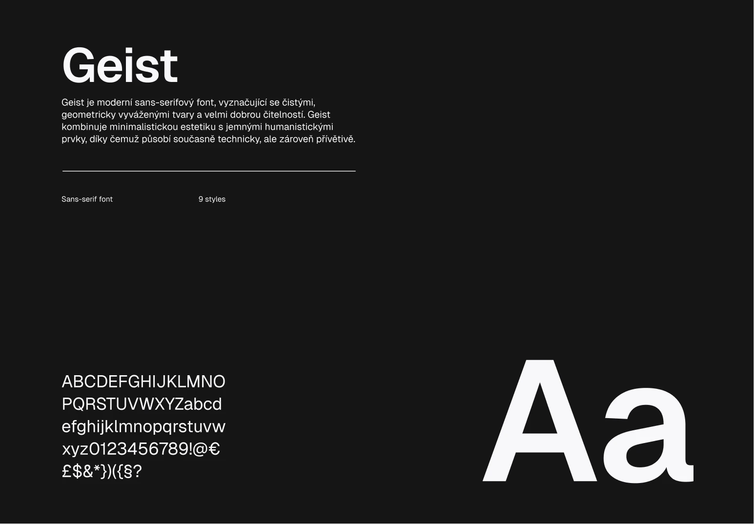
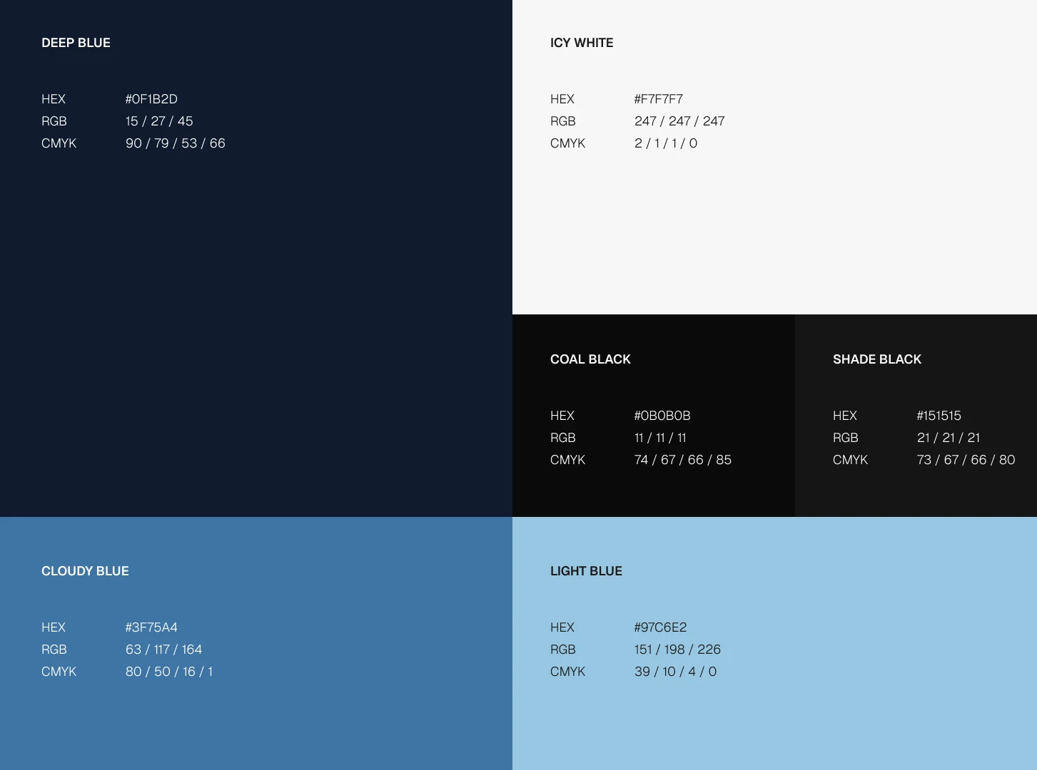
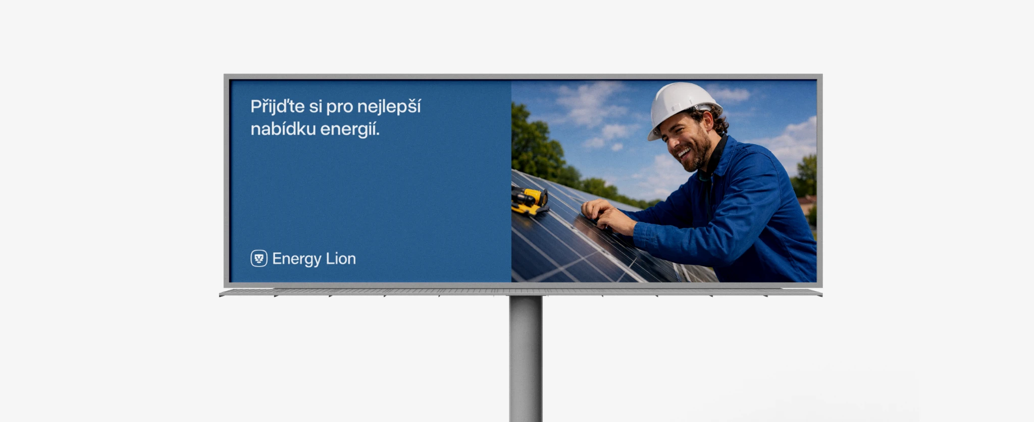
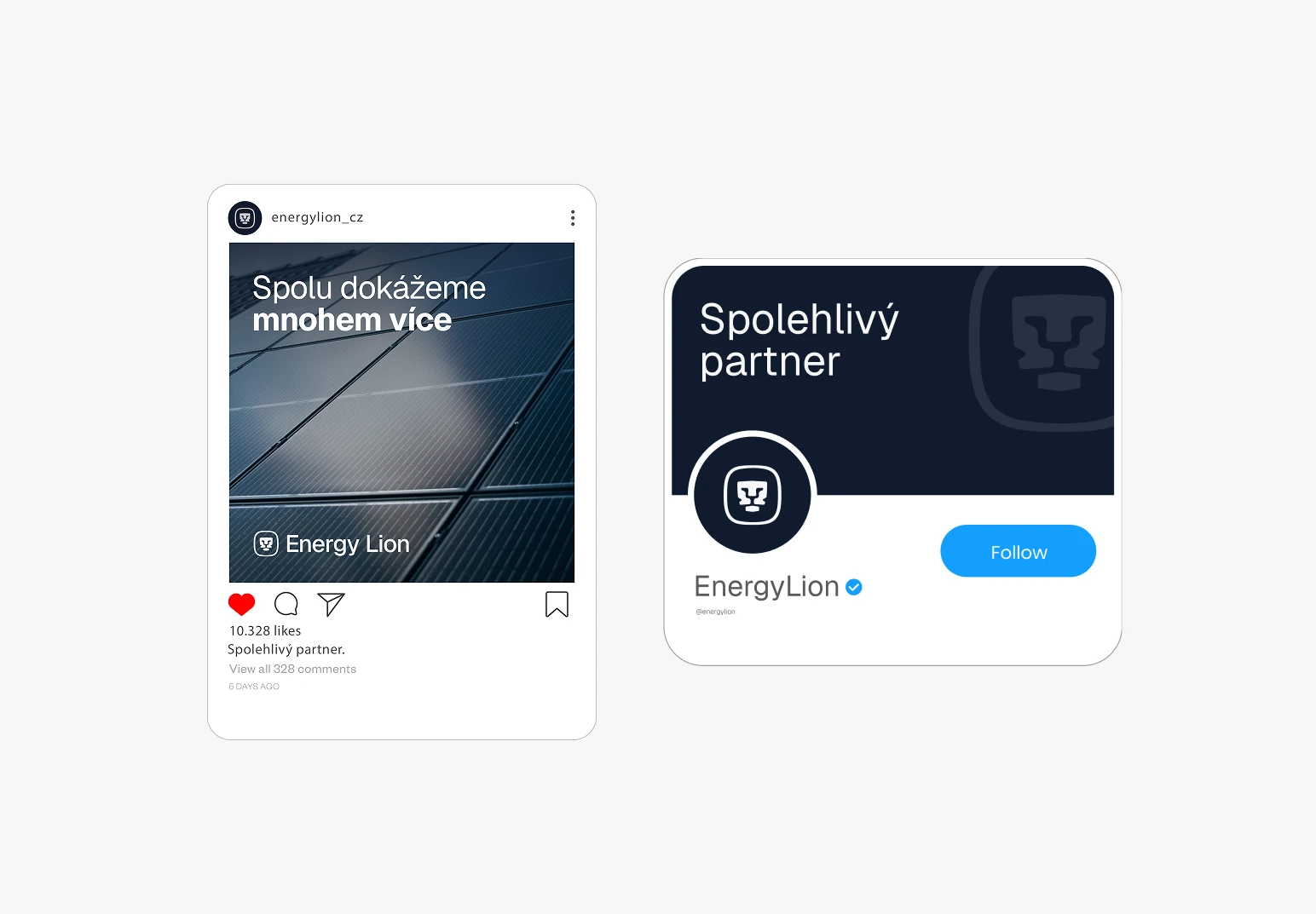
A restrained visual language supports the new identity across communication and applications. Typography, color and layout were designed as one coherent system, giving Energy Lion a consistent foundation that can work across digital communication, presentations, printed materials and public-facing brand touchpoints.



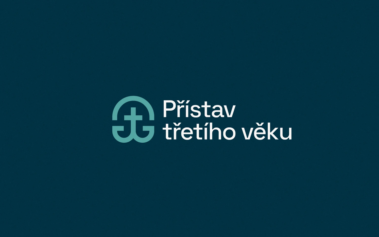
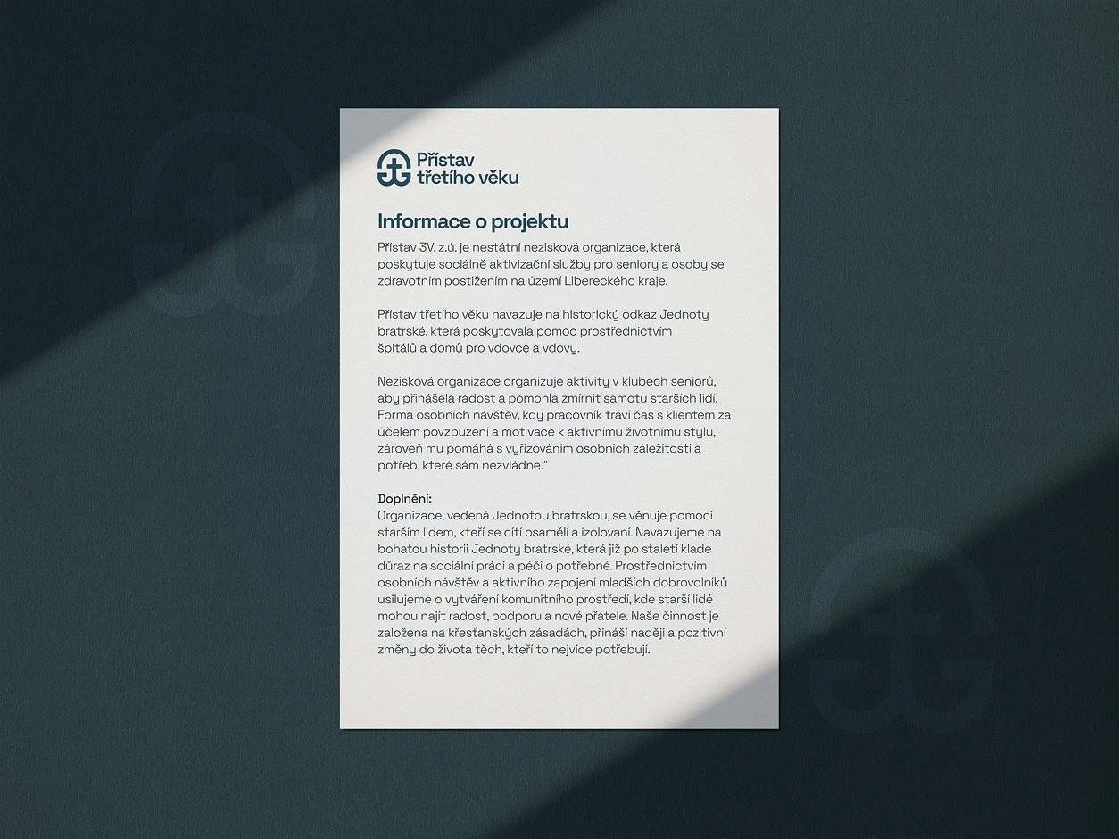
Přístav třetího věku (The Harbour of the Third Age) is a non-profit organisation helping seniors and people with disabilities overcome loneliness through social activities, personal support and a sense of community. Rooted in the historical legacy of the Unity of the Brethren, the organisation needed a visual identity that could express care and human connection while still looking trustworthy, subtle and contemporary.
This identity was developed as my concept for a new visual direction for the organisation. Although the concept ultimately remained at the proposal stage, it explores how the values and history behind Přístav could be translated into a cohesive contemporary brand.
2026
Designer
Visual identity
Brand Design
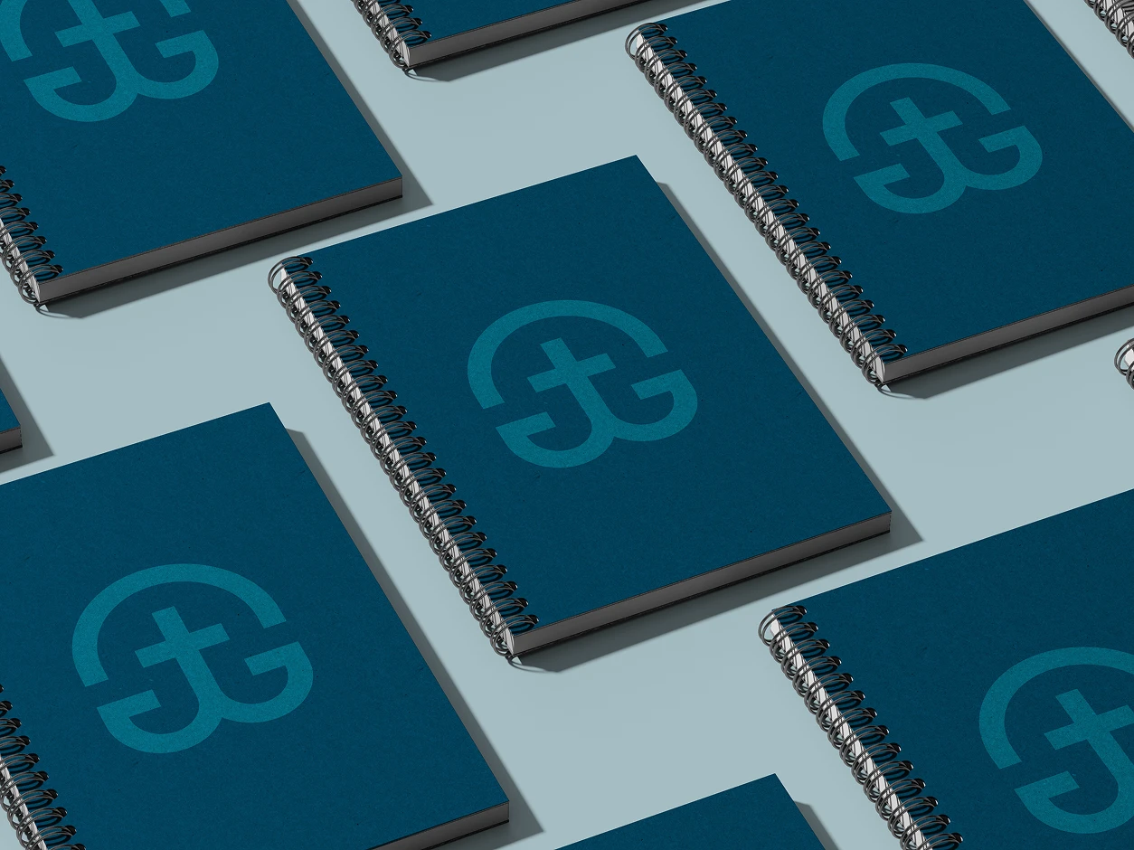
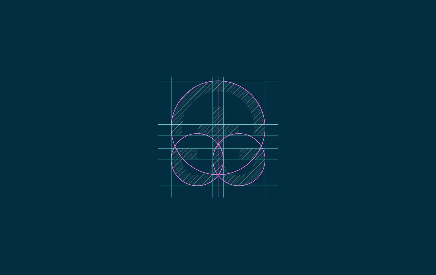
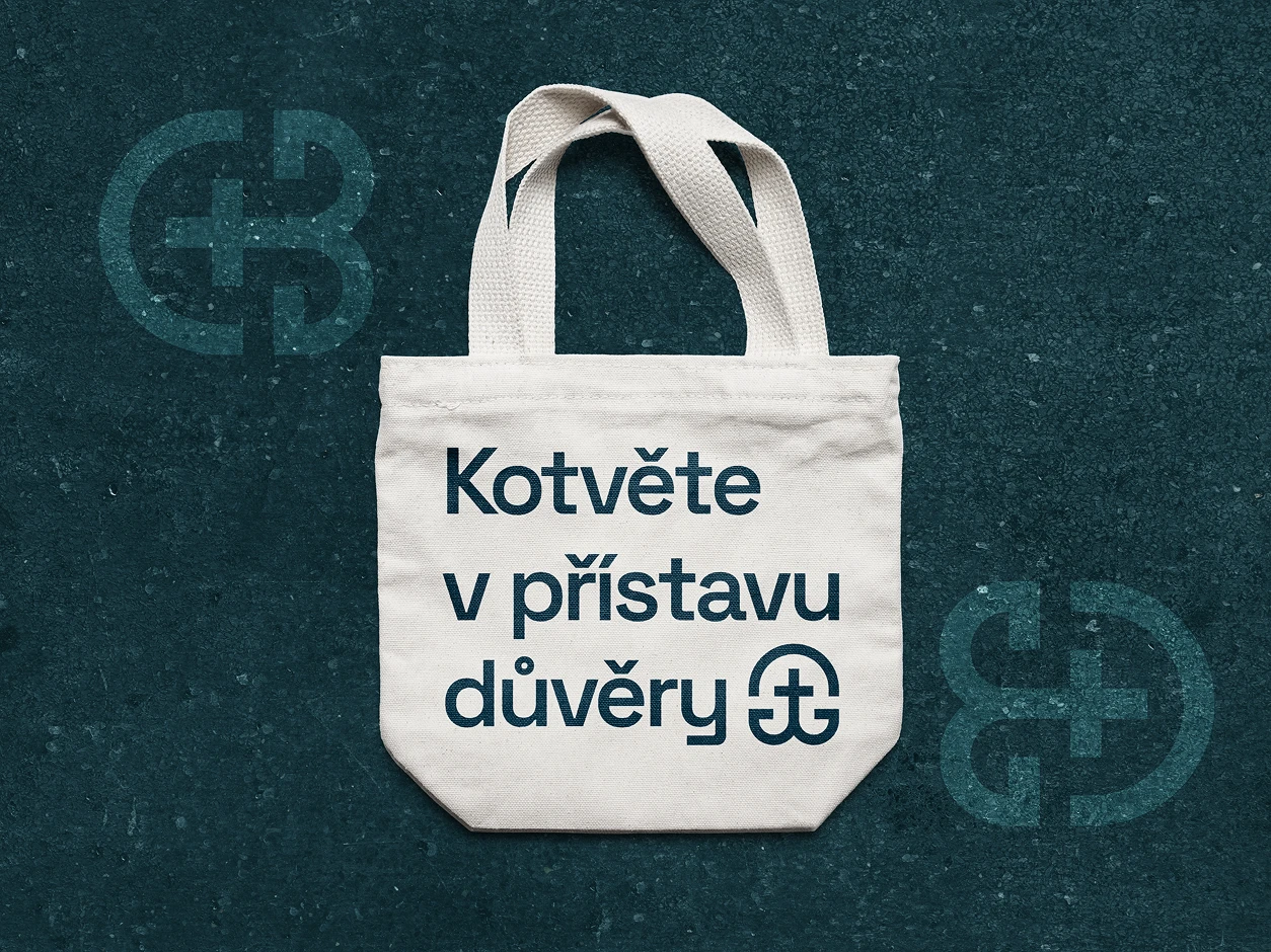
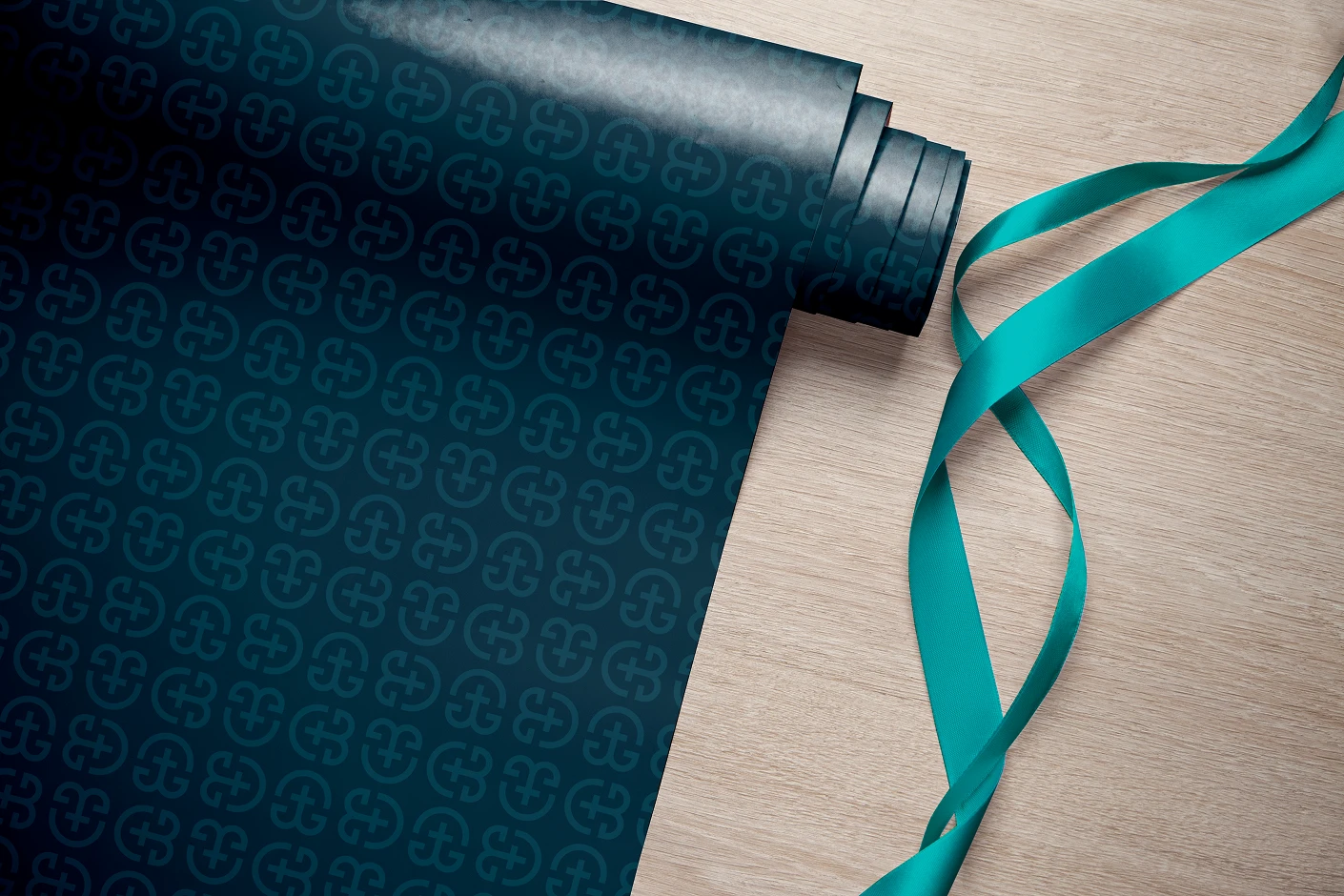
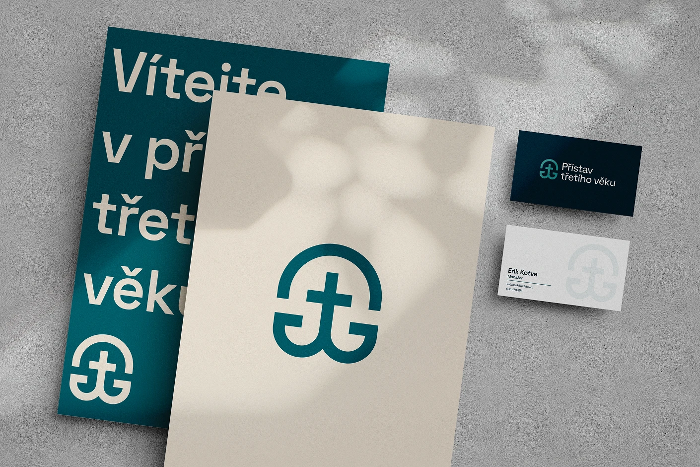
The identity began with the name itself. A harbour represents a place to anchor, find safety and feel supported — exactly what Přístav aims to offer. The organisation’s central symbol brings together four ideas: an anchor for the harbour, a cross referencing the Unity of the Brethren, the number three for the third age, and an arch representing a protected space. Instead of illustrating these signs separately, they were reduced into one compact mark that can carry the organisation’s history without feeling overly literal or religious.
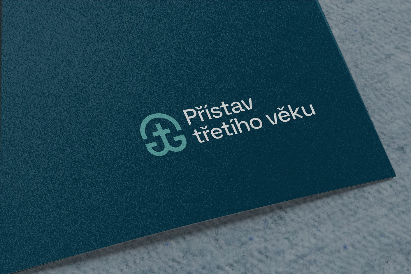
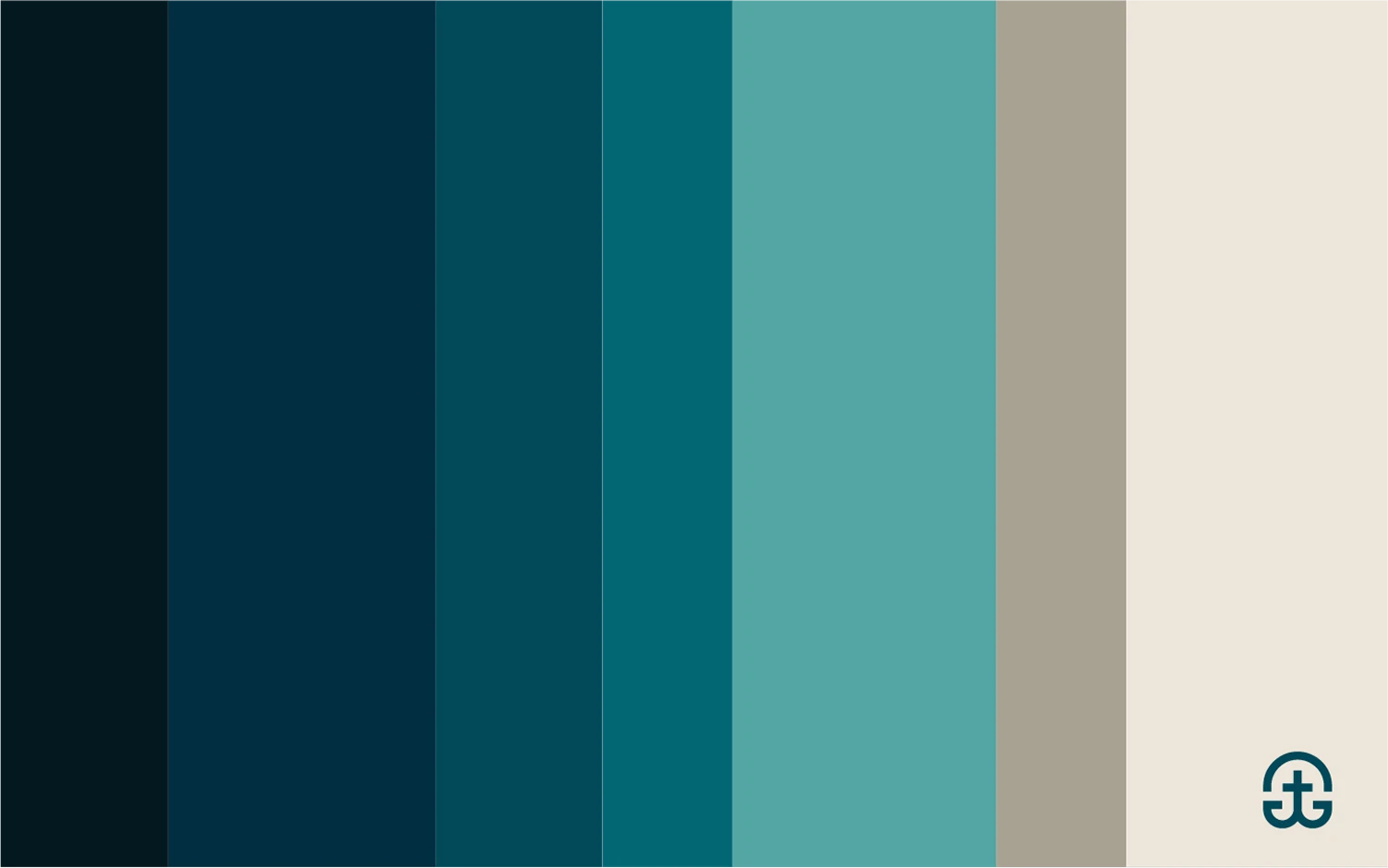
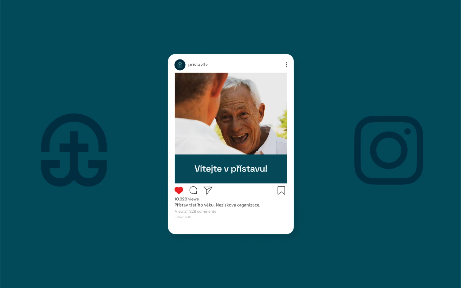
The rest of the visual language follows the same idea of stability and care. A palette built around deep maritime blues and softer turquoise tones grows naturally from the harbour metaphor, while warm neutral shades keep the identity human and approachable. The clean typography and generous layouts give the system clarity, allowing the symbol to become the main recognisable element across stationery, printed communication, social media and other applications. The result is a concept that feels less institutional and more like what Přístav aims to provide: a safe place to belong, connect and find support.



Papirek Production is a Czech production company built around documentary filmmaking and stories rooted in real people, places and experiences. The identity was created to give the company a visual language that feels as considered and cinematic as the work it produces — confident, understated and recognisable without competing with the stories themselves.


2022
Brand Designer
Brand identity
Art direction
Visual system
The project started from a simple idea: a documentary production company should have an identity that gives its stories room to breathe. Instead of relying on familiar film-industry clichés, the direction was built around a restrained visual system, strong photography and a distinctive monogram that can exist quietly in the background or become a recognisable signature on its own.
The visual identity balances documentary intimacy with the precision of a production studio. Monochrome imagery, generous negative space and a compact typographic system create a visual world that feels cinematic without becoming overly stylised. The result is designed to work equally well on a film title, a production credit, a digital presentation or a physical object.


Because documentary work is ultimately about people, the identity avoids feeling corporate or distant. The mark and typography are deliberately simple, leaving photography and human presence at the centre. Small branded details bring the system into the physical world while keeping the overall expression quiet, tactile and personal.


The system was developed as a flexible identity rather than a single logo lock-up. It can move between subtle production credits, editorial layouts and physical touchpoints while remaining recognisable. Every application reinforces the same idea: the brand is there to support the story, not to become the story.


Caparica Czech Surf Open is a surf contest held in Portugal, bringing together Czech surfers for a few days of competition, community and a shared love of the ocean. For the 2024 edition, the organisers opened a competition for the event's visual direction.
I approached the brief by looking back at the raw, playful energy of 1990s surf culture — combining bold typography, sun-faded colours, hand-drawn characters and a slightly imperfect printed feel. The goal was to create an identity that could work across the contest itself, from posters and social content to merchandise and the wider event atmosphere.
The concept was submitted as one of the competition entries. It wasn't ultimately selected as the winning direction, but the project became a strong exploration of how a distinct visual world can turn a surf event into something that feels like a real cultural moment rather than just another competition.
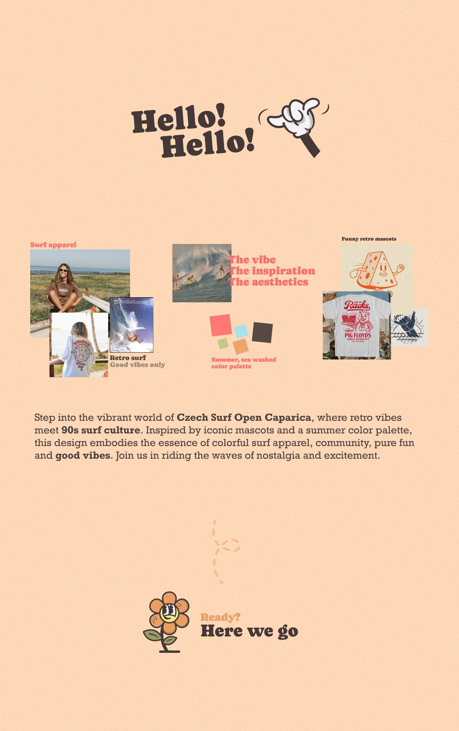
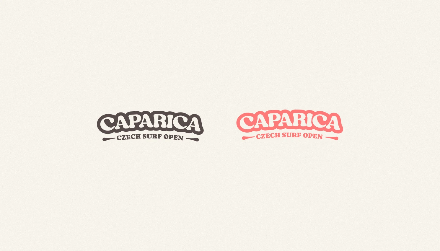
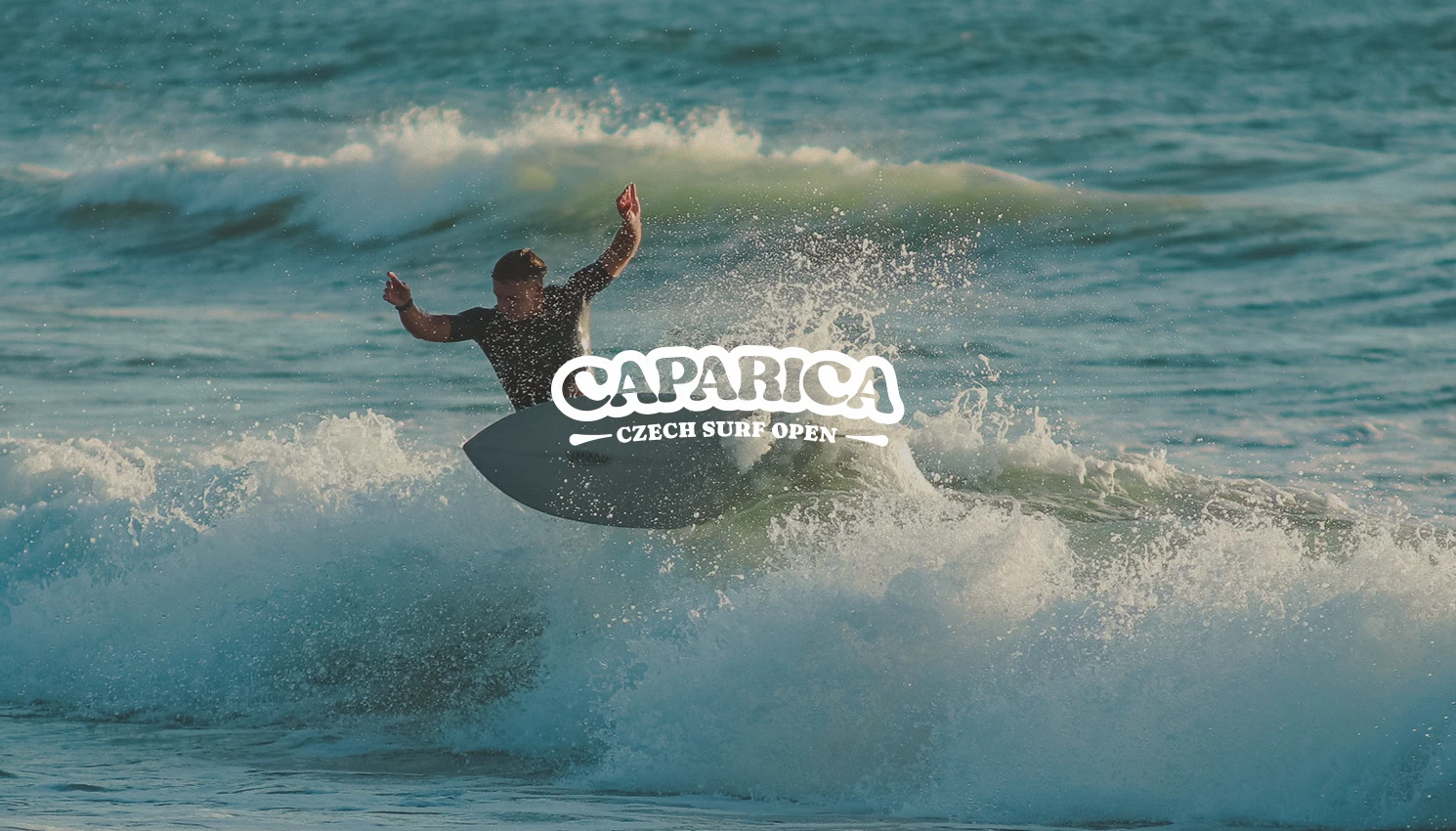
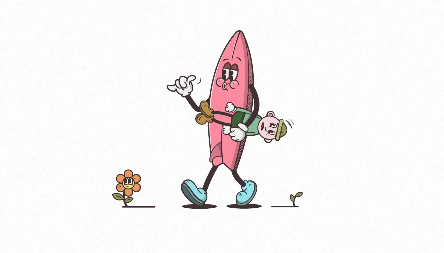
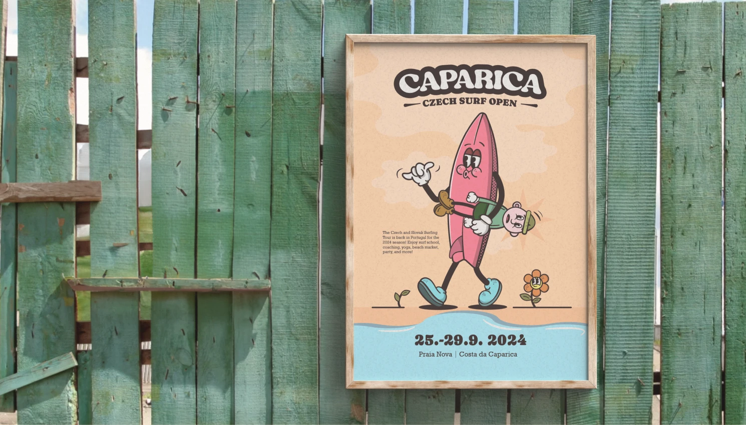
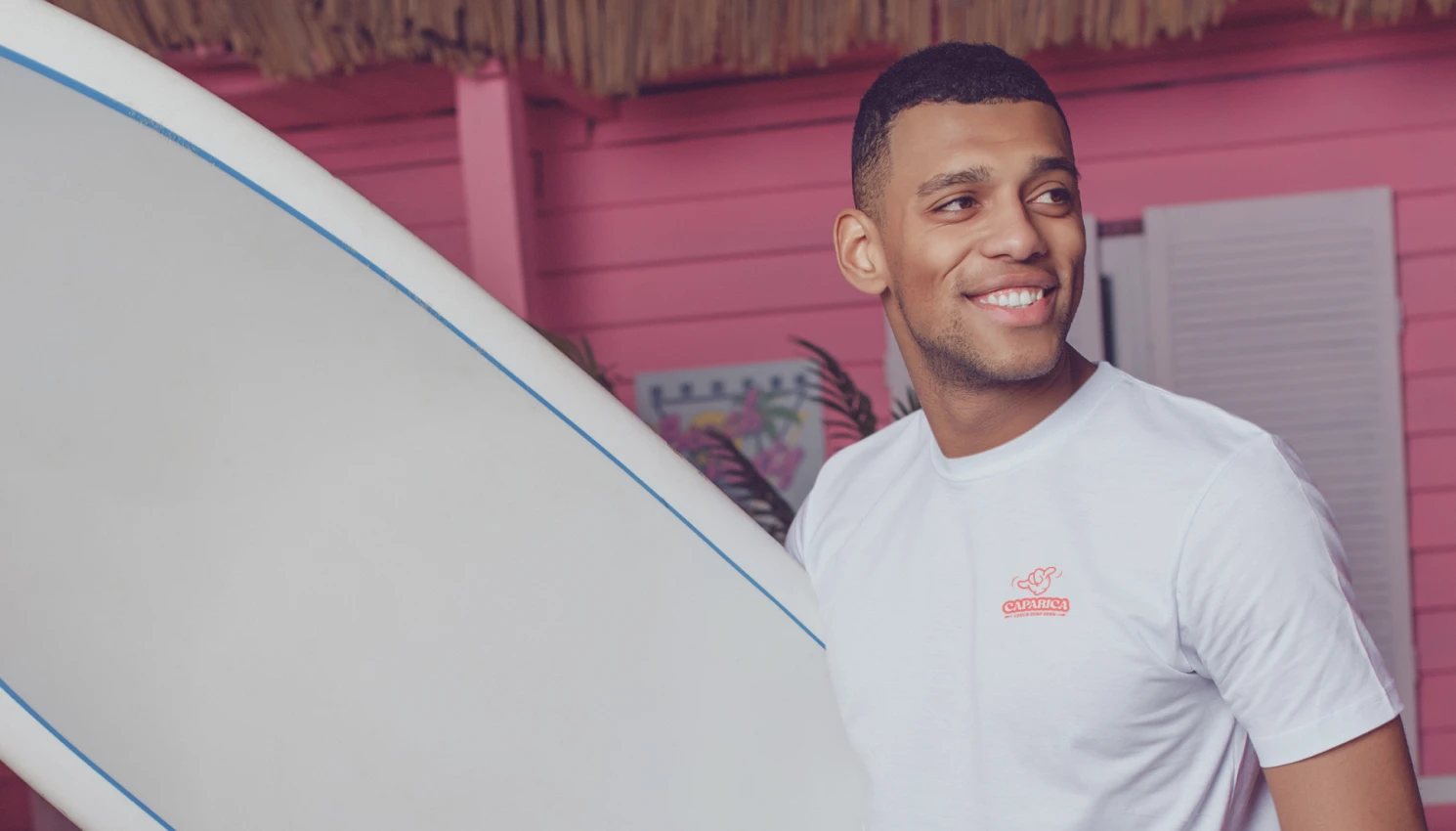
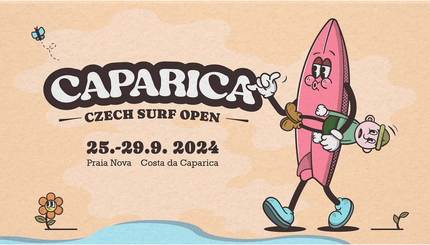
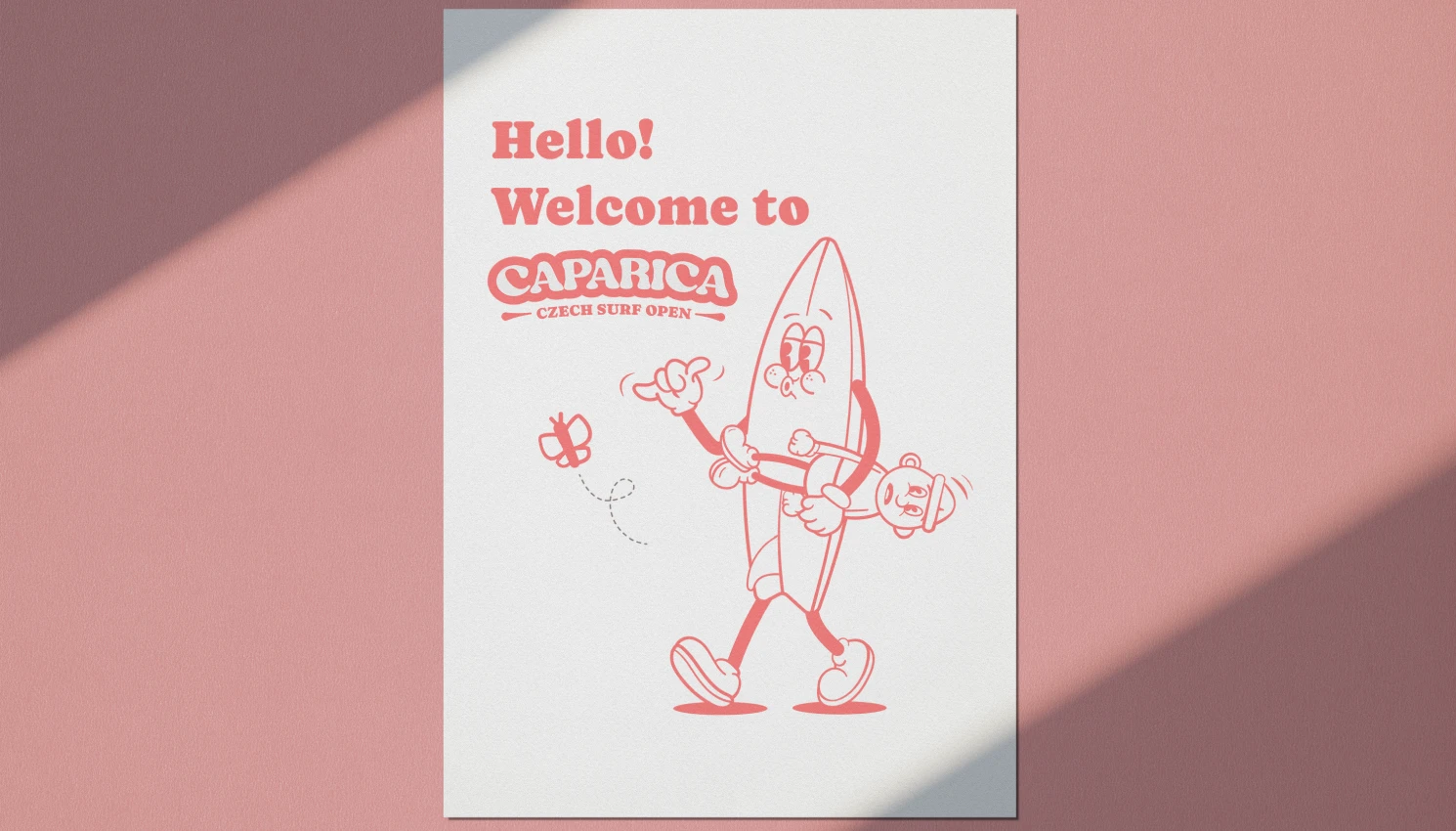
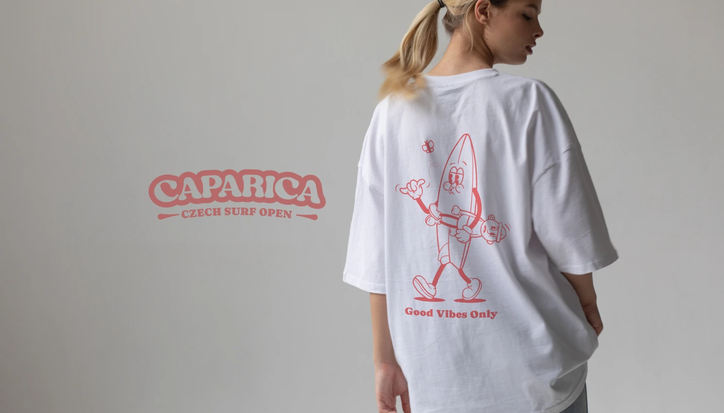
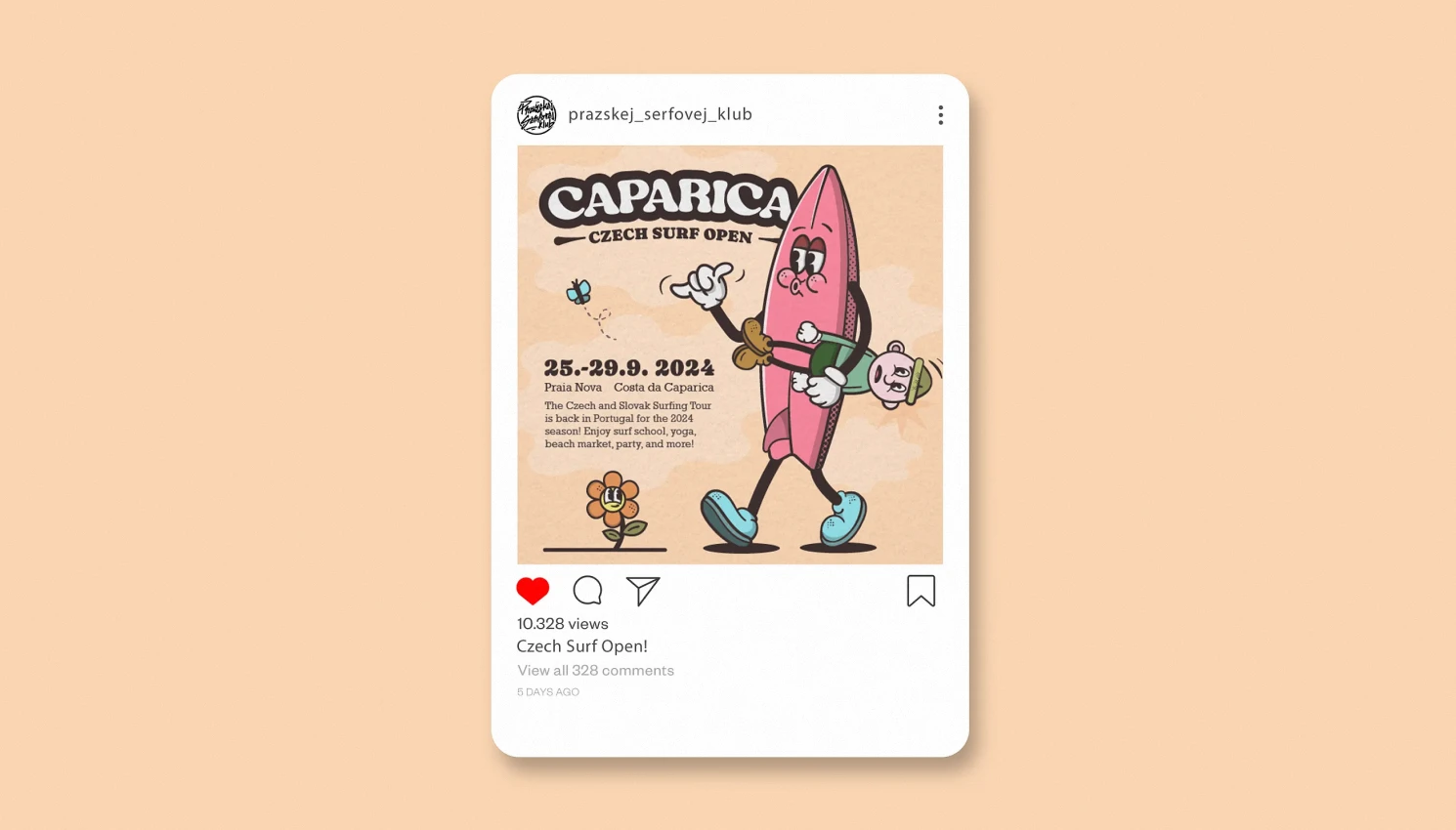
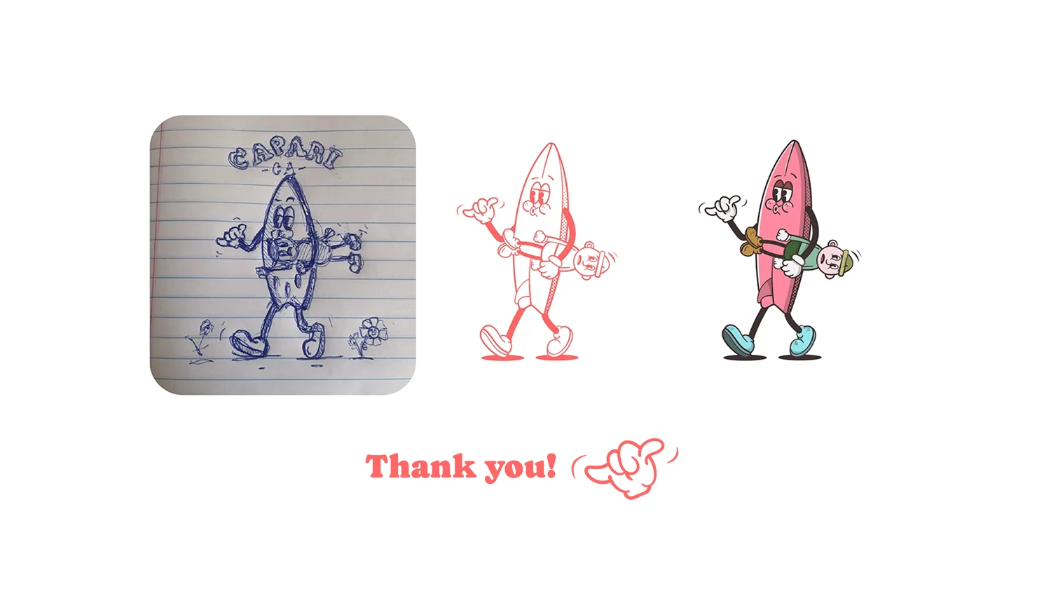
The final direction plays with the visual vocabulary of classic surf posters, independent magazines and early digital surf graphics. It balances nostalgia with a contemporary sense of composition, giving the event a personality that feels energetic, approachable and unmistakably connected to the coast.
Scalou is a digital product built around a simple idea: make discovering local businesses and getting meaningful discounts part of everyday city life. The app connects people with restaurants, bars, shops, services and experiences while giving partner businesses a new way to reach their audience.
I worked on Scalou from the ground up — starting with the logo and brand identity, then carrying the visual language into the website, promotional materials and the product itself.


2023
Brand & Digital Designer
Brand identity
Web design
UI/UX & App design
Campaign materials
The project began with the identity. The goal was to create a mark that could feel recognisable at a glance, work naturally at small digital sizes and still have enough personality to become the visual signature of the whole product. From there, the typography, colour palette, graphic details and image direction were built into one flexible brand system.

Once the brand language was established, I translated it into the website. The design had to communicate the value proposition immediately — discover, choose and save — while making a growing catalogue of offers feel simple and approachable. Dark surfaces, bright accents and strong product imagery became the foundation for the digital experience.


The website was designed not just as a presentation layer, but as an extension of the product. Clear calls to action, visible app-store entry points and a straightforward hierarchy help move visitors from curiosity to trying Scalou. The same visual rules keep the brand consistent across landing pages, offer screens and promotional touchpoints.


With the core digital experience in place, the identity was extended into promotional communication. The campaign language needed to be energetic enough to compete for attention in a busy city, while still feeling unmistakably Scalou. Bold messages, app-focused compositions and the purple accent made the benefits of the product easy to understand at a glance.


The final result is a visual system that can move between brand identity, website, advertising and the app without losing its character. Scalou needed to feel like more than a discount catalogue — it needed to feel like a useful companion for discovering the city. The design keeps that idea at the centre: clear enough to use quickly, expressive enough to be remembered.
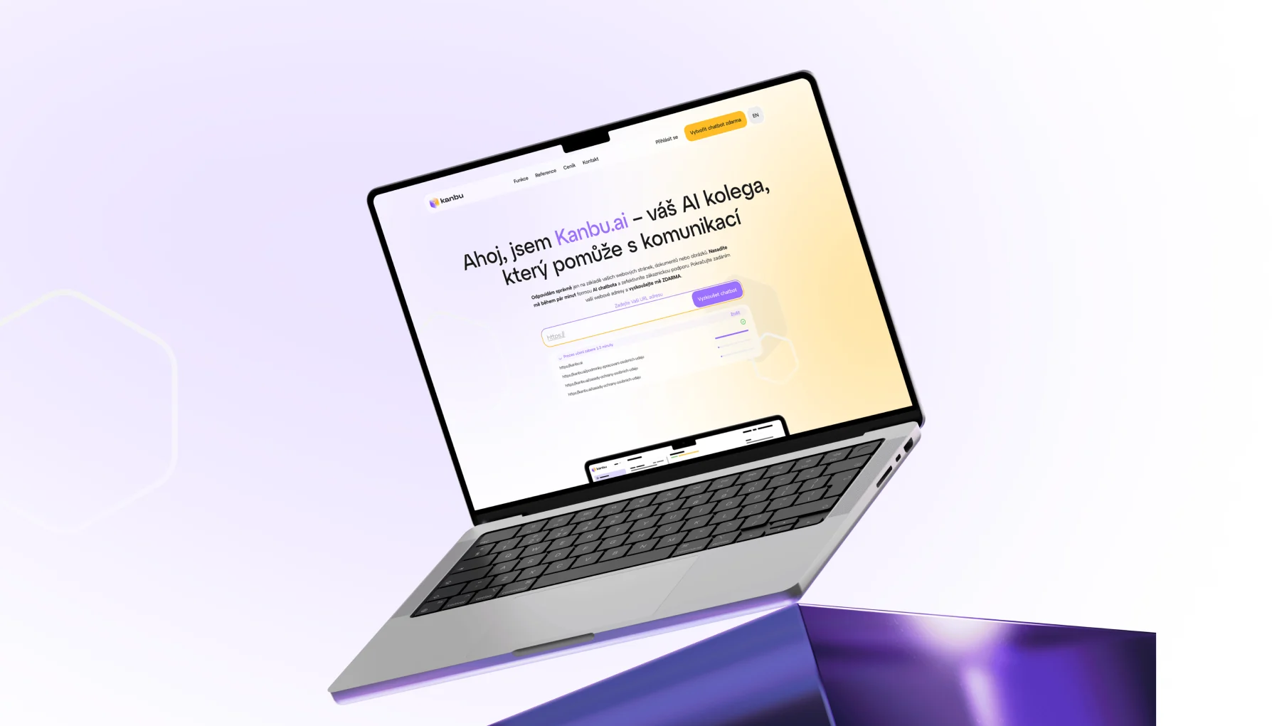
Kanbu is an AI assistant that helps businesses handle customer conversations using their own knowledge. It learns from a company’s website and documents, gives answers grounded in those sources, and can connect to the tools teams already use. I was brought on primarily as a UI designer to help bring the chatbot to life, shaping the product experience as the team prepared to launch it.
2025
All-in in-house designer
UI / UX Design, Brand Design, Marketing Design
Alongside the product work, I designed and built a promotional website to introduce Kanbu and make the value of the chatbot clear from the first interaction. I wanted the experience to feel as engaging as the product itself, so I added a few playful details: a functional interactive prototype that lets visitors try creating their own chatbot, plus custom Lottie animations that bring a little movement and personality to the page.

One of the key challenges was making the pricing easy to understand and genuinely useful. Instead of presenting visitors with a static price list, I designed an interactive calculator built around a draggable chart. Users can adjust different values, explore their own scenario and immediately see how the estimated cost changes. For anyone who wants to dig deeper, the experience also leads into a detailed breakdown of the available plans, limits and pricing.


The website was a fairly complex project, made up of many smaller design details that might seem subtle on their own, but together give the whole experience its character. I used these visual hooks to catch visitors’ attention, add personality and make the different sections feel connected. And since a large part of the audience would be visiting from their phones, I made sure the entire website was fully responsive and carefully adapted for mobile, too.


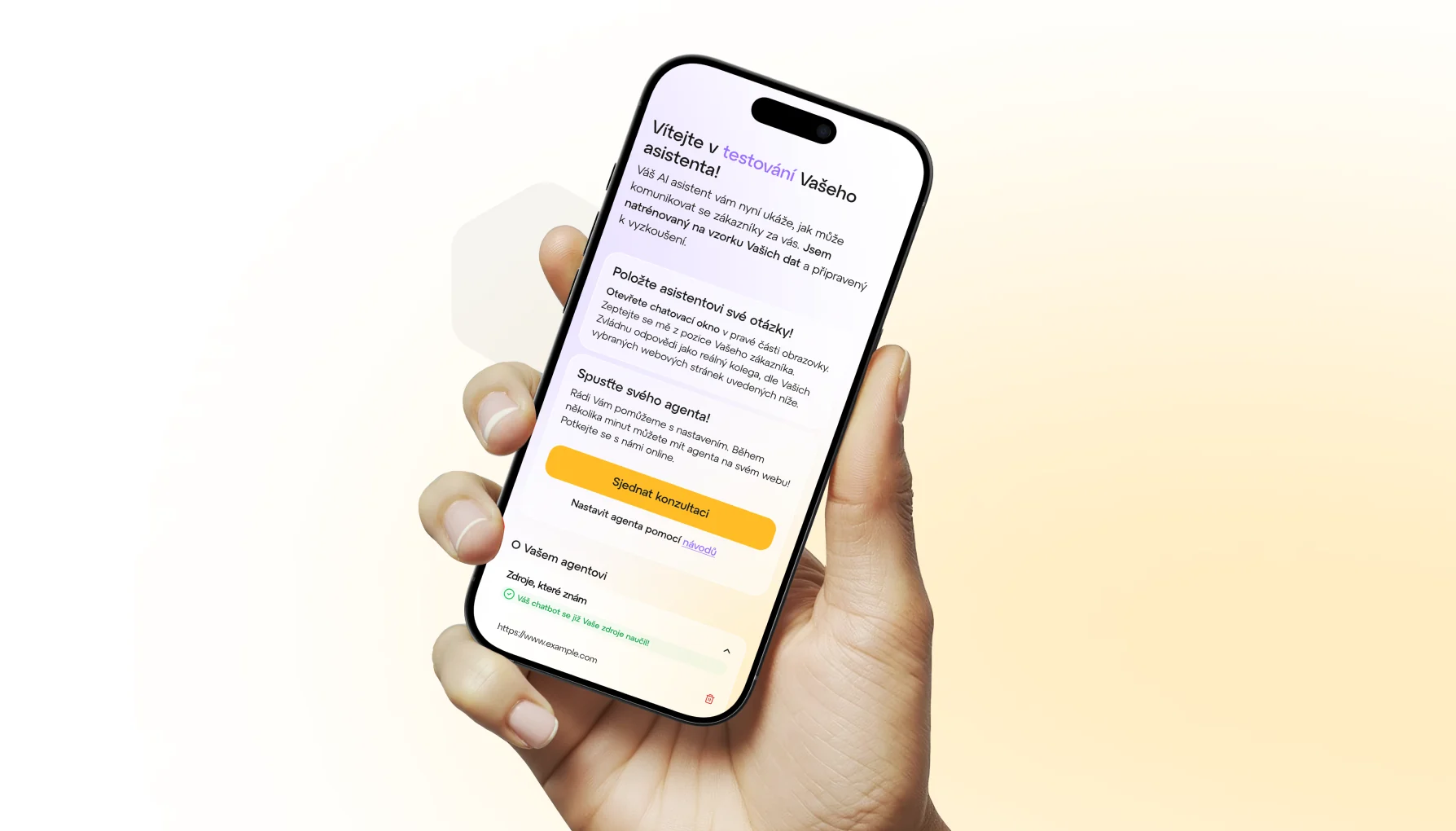
One of the most extensive parts of the project was designing the full UX and UI for the agent testing playground. I worked through every step of the experience, giving users a space to explore how their assistant behaves, test real customer questions and fine-tune its setup using the content and information from their own website. The goal was to make the whole process feel clear and approachable, while still giving users the flexibility to properly try out and configure their agent.


Much of the work came down to getting the small details right. I designed and refined everything from chat bubbles and message grouping to long messages, chat colours and dark mode. I also worked through message reactions, typing states, hover states, micro-animations and the interactions that make the conversation feel natural and responsive. Each detail may seem minor on its own, but together they make the chat experience feel clear, considered and easy to use.

I also designed the entry point into Kanbu’s admin system, with a focus on making the experience feel clear, approachable and easy to navigate. From the first setup steps to the individual agent settings, I worked on structuring the interface so users could understand what to do next, customise their assistant with confidence and manage it without getting lost in the process.


